Brand Story
Part III
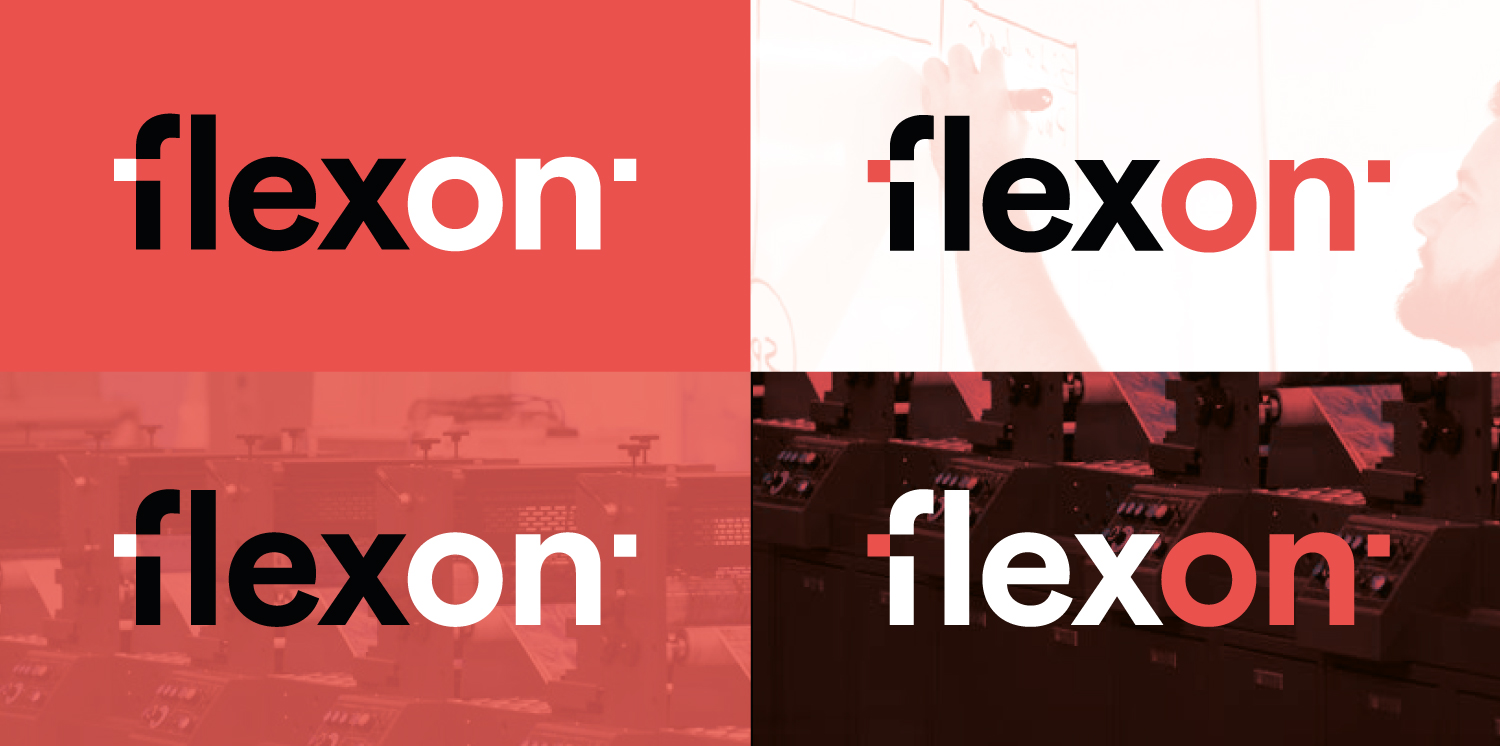
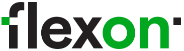
New logo
The logo has gained a new, bold form. The typography refers to the layout of a flexographic machine. Its technical, raw look brings to mind a set of rollers, gears, and the role of the label material. This is a very apt observation.
In the first version, the proposed logo was given the color Pantone Warm Red.
However, in the end we decided to make a change. A bold and revolutionary change, looking from the perspective of Flexon’s history. We decided to move away from red to green. It was that moment where everyone unanimously agreed that red was no longer a color we wanted to identify with.
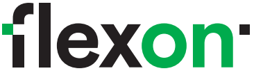
The color green, in many ways, fits better with our temperament, our relationships with each other or our attitude towards the environment.
We want to build our identity based on the content of the perception of green.
Green is the color of balance. It strengthens, calms, brings peace of mind and renews the strength of the body. It is the color of nature, and therefore of life. Green helps us to open up and encourages communication with others. Perfectly strengthens trust. It encourages cooperation.
These are important qualities for us. Especially in the process of strengthening our team as well as in the process of building relationships with customers or suppliers.
This is the Flexon we build and this is the Flexon we strive for every day.
We can assure you now, that by choosing the services of our printing house, you support the creation of a socially responsible company, for which care, responsibility and ecology are the most important signposts.
Thank you for being with us. Thank you that together we can strive for a better world.